
CASE STUDY
Built Into the Work, Not Around It
A reusable component library built for 100+ internal applications
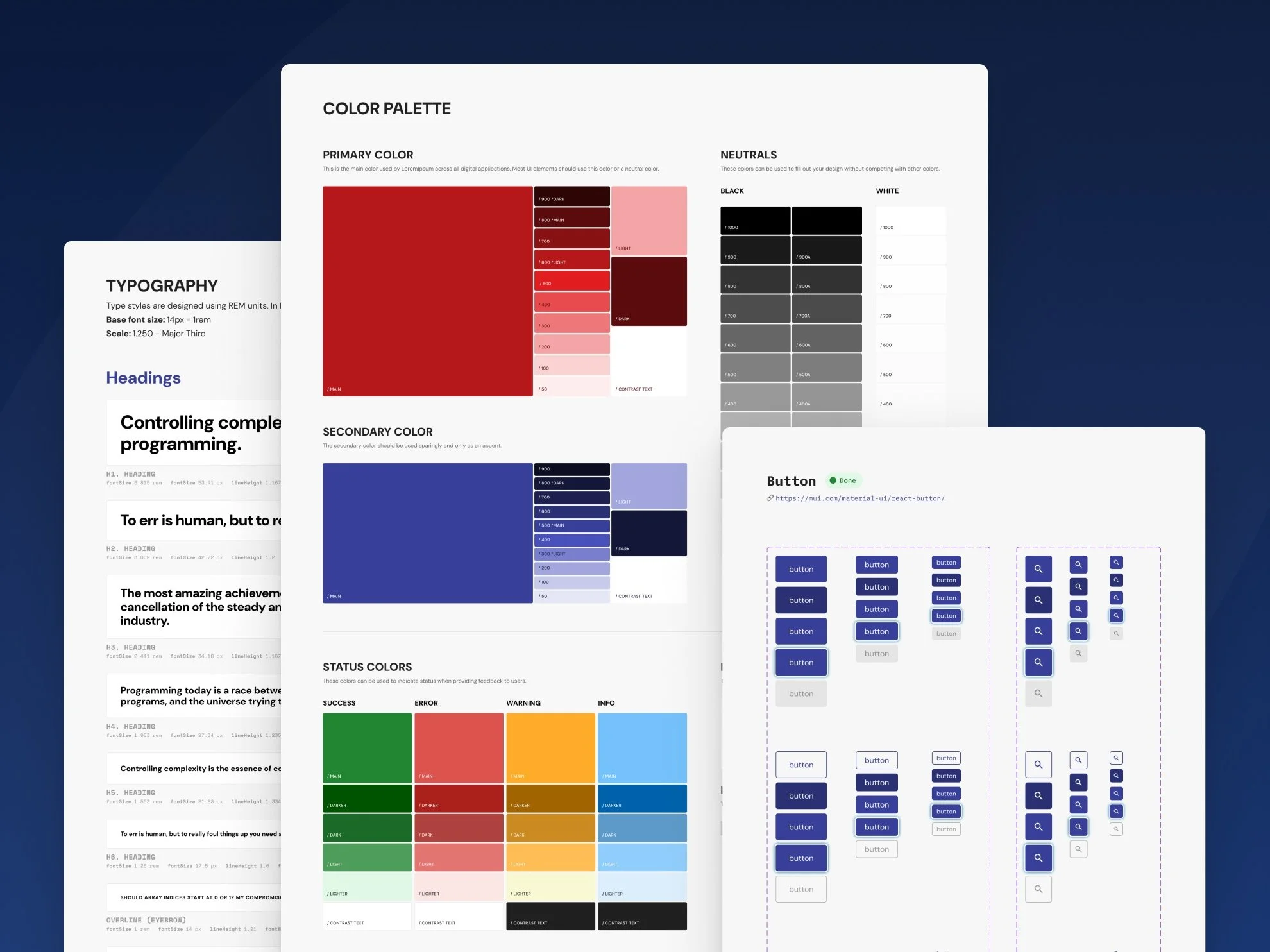
Our team was responsible for several dozens of internal applications, and none of them looked or worked quite the same, since every new app started from zero and cost more time than it should have to design and build.
We ended up building a design system to fix that, even though we never got a dedicated quarter set aside to do it.
The Brief vs. The Real Problem
No one asked us to build a design system. My team decided we needed one ourselves, without a brief or a stakeholder request behind it, and we were told plainly that it couldn't take priority over the project work we'd already committed to each quarter.
The real problem wasn't that the apps looked inconsistent, though they did. It was that my team, our other designers, the developers we worked with, and myself, kept solving the same problems from scratch on every project. We had more asked of us than we had capacity to give, so repeating the same design and development work over and over wasn't sustainable, and building something reusable became less of a nice-to-have and more of how we intended to keep up with our commitments at all.
Research & Discovery
Before committing to an approach, we weighed building a system entirely from scratch against building on top of an existing library. The developers on our team already knew Google's Material UI well, and that mattered more than most other considerations, since a custom system might have given us more control but would have meant a slower ramp-up for the people who actually had to build with it every day.
We chose Material UI as the foundation, then styled and extended it to match our brand and the patterns our apps actually needed. The goal wasn't just speed, it was getting developers to actually use a shared system instead of making one-off decisions on their own.
Strategic Decisions & Tradeoffs
The decision to build on Material UI instead of starting from scratch was itself a tradeoff, since it meant giving up some control over the underlying architecture in exchange for speed and adoption. That trade paid off, but it also introduced a problem we had to design around.
Material UI gave developers a lot of flexibility, which they liked, but that same flexibility meant that even when a designer handed off a clear design, a developer might interpret it differently or take more liberty than the design called for. We never had to push back hard on anyone directly. Instead, we made the defined system the path of least resistance, so that once the components and patterns already existed and were ready to use, reaching for them was easier than improvising something new.
The other major tradeoff was pace. Building the entire system in one effort would have pulled us off the project work we'd already committed to, and a lot of that work overlapped with what the projects needed anyway, so we built incrementally instead, adding components only when a specific app made the need for them clear. That kept the system's scope tied to real demand instead of a wishlist, and it meant the design system work and the project work were often the same work.
The Work
The system lived in a Figma file kit covering styles, theming, and a growing library of core components and patterns, all built to be reused across the team's applications, with nothing added speculatively. A component earned its place once it was clear multiple apps actually needed it.
Rather than handing developers a finished kit to implement on their own, we included them in the conversations about how components should work before we built them, and as new pieces were ready, we delivered them alongside the actual project designs the team was already building toward, so the design system and the shipping work moved together instead of the system living as a separate initiative competing for attention.
Outcomes & Impact
Project work got faster, more consistent, and higher quality as the system matured, and apps built with it required less back-and-forth between design and development since the pieces developers needed were already defined and ready to use.
The system was still actively growing when I left the company for my next role, so it never reached a defined finish line, which feels like a fair reflection of how it was built in the first place: designed to keep pace with the team's actual needs rather than to hit a completion date.
If I were building this today, I'd approach it differently, since tools like Claude Code are now available. I'd build the system's components directly rather than relying entirely on an existing library, using similar conventions to Material UI but tailored specifically to our brand and needs, which would be a more efficient path than what we had available at the time.
Closing Reflection
This project taught me how to be strategic with time, both mine and my team's. When there's no room for extra work, the only way to get something worthwhile built is to make it part of the work you're already doing.