
CASE STUDY
Designing Bill Pay for Both Ends of the Relationship
A customer bill pay portal and a finace team admin portal, rebuild in tandem for a Fortune 50 company
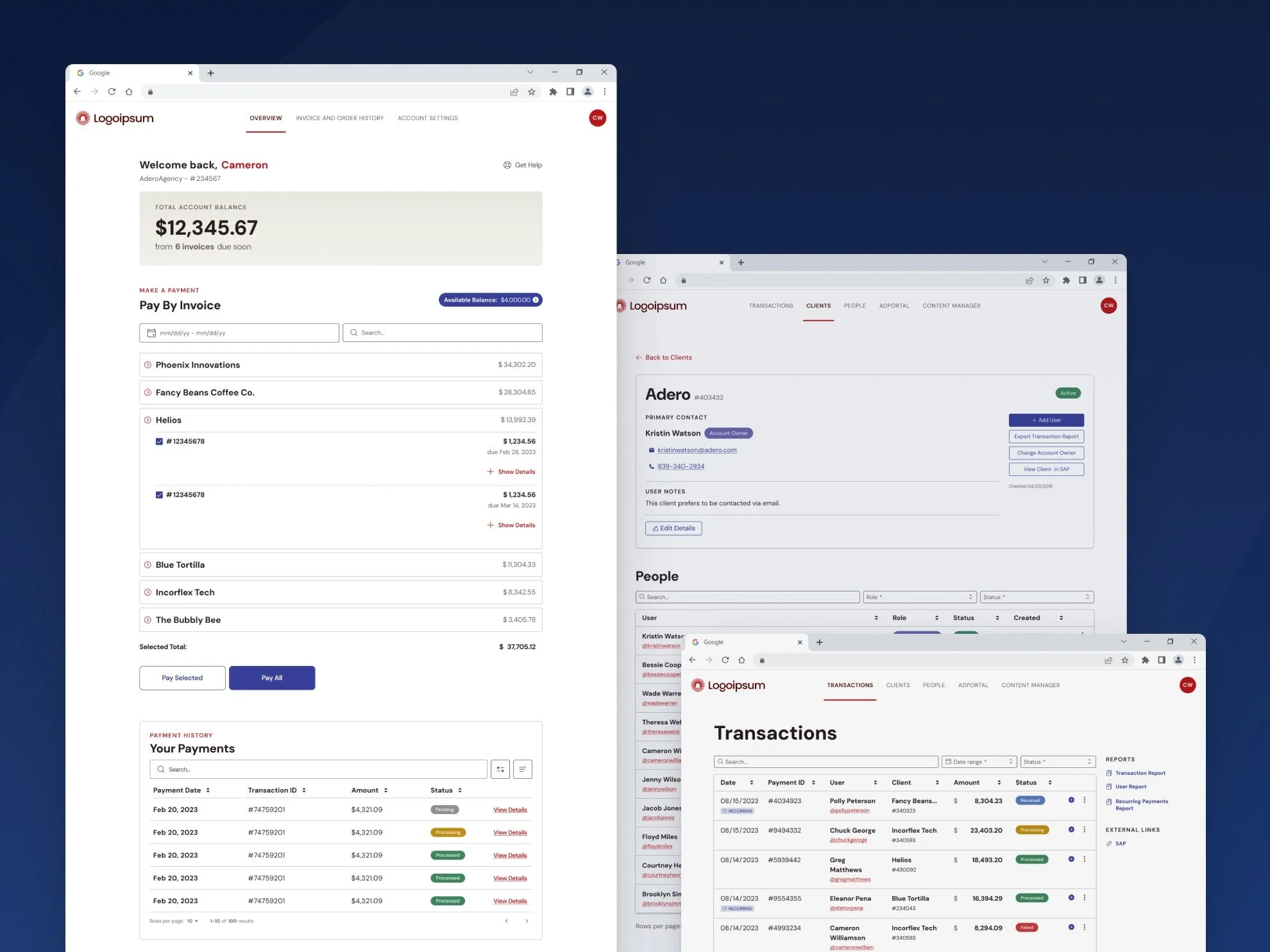
Designs have been slightly modified for anonymity
Both the customer-facing bill pay portal and the internal finance team's portal for managing those payments had grown outdated and difficult to use, and neither could simply be patched, since the technical foundation behind both needed to be rebuilt from scratch.
Customers, who ranged from companies advertising themselves to agencies managing invoices on behalf of their own clients, had to manually type in payment amounts with no clear view of their full account picture, which meant errors were common and any real account question meant a phone call to finance.
Finance, meanwhile, was stuck manually pulling up client account information by hand every time someone called in, which cost them nearly as much time as it cost the customers who needed the help in the first place.
The Brief vs. The Real Problem
The original ask for the customer portal was a fairly standard list: make payments easier, give better access to invoices and balances, offer more payment options, improve access to support, and bring the design up to date with current branding. All reasonable, and all things we ended up doing.
But the real scope of the project ran deeper than a visual refresh. The technical foundation behind the portal needed to be rebuilt from the ground up, which meant this wasn't a redesign so much as a full rebuild wearing a redesign's clothes. And because the finance team's own portal for managing those same accounts needed to reflect whatever new capabilities we gave customers, a two-part project was built into the plan from day one. We sequenced the customer portal first, since it was our most visible external-facing product and mattered more to the company's brand, and treated the finance team's portal as the necessary second half of the work rather than an afterthought.
Research & Discovery
For the customer portal, we started by cataloguing what was actually broken: users had to manually enter payment amounts with no smarter defaults, account self-service was so limited that people called finance constantly just to check on their own accounts, and the outdated branding was quietly undermining trust in the tool. After talking with a handful of internal stakeholders and client representatives, we decided against trying to solve everything in one release, and instead prioritized what would get users the most value fastest: invoice details, account balances, account management, and account relationships, with a plan to gather feedback and keep iterating from there.
The finance side of the research looked different, mostly because the finance team was small enough that I could sit with the people actually using the tool on a regular basis. That access mattered. Rather than working from secondhand requirements, I heard directly from finance about what was costing them time, most notably how often they had to manually look up account information for clients themselves, work that a better tool should have made unnecessary.
Strategic Decisions & Tradeoffs
The biggest tradeoff on the customer side came from the technical rebuild itself. Because the backend needed to be reconstructed anyway, we could have tried to launch everything at once, but that would have meant a much longer wait before users saw any improvement. We chose to ship a strong first pass instead, and that decision came with real costs: limitations in how the underlying account data was structured meant we had to pull back on features like batch payments across multiple invoices, recurring payments, and credit balance visibility, with a plan to reintroduce them later. That tradeoff did create some confusion for users around payments and credit balances in the meantime, a fair price for getting the core experience in front of people sooner rather than later.
The finance portal called for a different kind of judgment. The team was fairly small and had built real muscle memory around the existing data-table-based tool, including the ability to export reports the way they always had. Rather than treating this as a chance to reinvent their workflow, I deliberately preserved what already worked and focused the redesign on fixing the underlying information hierarchy and adding the same new capabilities customers were getting, like account balances and invoice details, along with updated visual styling to match the brand. The goal was meaningful improvement without forcing the team to relearn a tool they already relied on every day.
Underneath both of these decisions was a constant back-and-forth with the development team to understand what was actually technically possible given the constraints of the existing backend system we were integrating with. Design decisions that looked simple on the surface often ran into real limitations once we got into how the underlying data was structured, so staying close to the developers throughout shaped the scope as much as any user research did.
The Work
The customer portal's first release centered on the functionality we'd prioritized: invoice details, account balances, account management, and account relationships, all delivered inside a refreshed visual design that finally matched current branding and was organized around how different user types actually needed to complete their tasks, whether that was an advertiser managing their own account or an agency managing several on behalf of clients.
On the finance side, the redesign kept the team's familiar data-table structure and export capabilities intact while reorganizing the information hierarchy and layering in the same account and invoice details customers could now see, so finance always had at least as much visibility as the people they were supporting. Finance team members were involved throughout the process rather than brought in at the end, which meant nothing in the final design came as a surprise to them and they had a real hand in the decisions that affected their own day-to-day work.
Outcomes & Impact
Both portals were in the early stages of rolling out to a small set of users when I left the company for my next role, so I wasn't able to see the longer-term results. What I did see was encouraging: preliminary feedback on the customer portal was positive, though further adjustments were already expected, and the finance team had been eagerly anticipating the release and was excited about how much easier it stood to make their day-to-day work. The one known downside was the confusion some users experienced around payments and credit balances, a direct consequence of the batch payment limitations we'd knowingly traded off for a faster first release.
Closing Reflection
What stayed with me most from this project was how much the relationships mattered, not just the designs. Sitting with the finance team regularly and actually understanding their day-to-day needs built a level of trust that made the collaboration work, and staying just as close to the developers to understand what the backend could and couldn't realistically support shaped better decisions than user research alone could have gotten me to.