
CASE STUDY
Surfaced, Not Buried
A dashboard redesign consolidating a learner's scattered subpages into one summary view on an enterprise learning platform
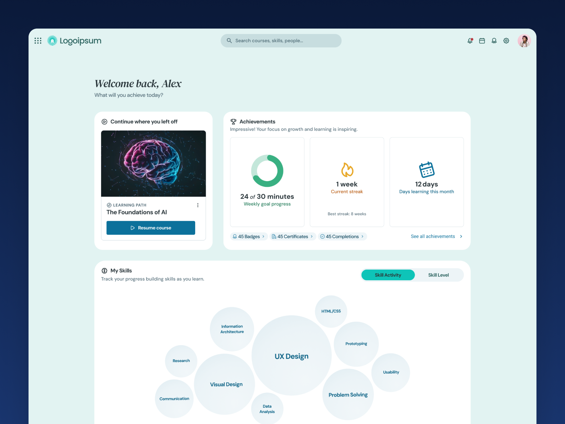
Learners had a page meant to bring together everything about their learning progress, but it was really just a collection of links, dated in appearance and mostly empty until you clicked into each one. Getting a real sense of your own progress meant navigating through a string of sparse subpages one at a time, so a page that was supposed to orient learners quickly to where they stood was quietly doing the opposite.
The Brief vs. The Real Problem
Product formally asked us to improve the page, but my team had already sensed this was one of the parts of the platform struggling to deliver real value, so the ask and our own read on the problem lined up. The real problem wasn't the page's age or appearance so much as its structure. It functioned as a directory, not a destination, and a learner had to commit to a click before they even knew whether it was worth their time. Fixing that meant rethinking the page as a dashboard rather than a set of doors, surfacing the substance of each section directly instead of making people go find it.
Research & Discovery
We pulled from several directions to shape this. I combed through usage data in an analytics tool to see which subpages learners actually visited most, our UX researchers ran direct interviews with users and customers about how useful they found the page, and in-app feedback prompts gave us an ongoing read on sentiment. I ran my own expert evaluation and brought recommendations on where I thought the highest-impact changes were, and product leadership and the Senior Manager of UX Design weighed in with their own perspectives too. That combination of data, direct user voice, expert judgment, and leadership input gave us a fuller picture than any single source would have on its own.
That research also surfaced two ideas we didn't end up pursuing yet: bringing certifications into this page, and surfacing personalized content recommendations directly here instead of only on the homepage. Both stayed on the table for future work rather than getting folded in.
Strategic Decisions & Tradeoffs
The most immediate constraint was technical. Pulling summary information from a dozen or so different areas of the platform meant a real increase in API calls, so every additional piece of data we wanted to surface came with a real performance cost to weigh against its value. Finding the right balance of what to show, and how much of it, took genuine back-and-forth.
The order those sections landed in took just as much discussion. Subpage visit data from our analytics tool played a real role, sections with higher traffic moved higher on the page, but it wasn't purely data-driven. Some groupings came down to logical relevance, placing related sections near each other even when the raw numbers didn't obviously call for it, and in a handful of cases, product made the final call.
Scope decisions mattered here too. We deliberately left certifications out of this version since that functionality already existed elsewhere on the platform, and touching it would have expanded scope well past what a single quarter could support. Content recommendations stayed out for a more practical reason: we didn't yet have a reliable technical way to generate them, and that work was already planned for a future quarter.
One of the clearer moments of restraint came from the skills section. We built a bubble visualization showing a learner's top ten skills, sized by time spent learning each one, since that was the only skill metric we had reliable data for at the time. Early versions color-coded those bubbles by skill family, like design or software development, since that grouping felt meaningful. But the underlying data to support it wasn't actually in place yet, so rather than ship something that looked more sophisticated than it really was, we pulled the color-coding and kept it to a single color until the data existed to back it up properly.
The Work
The finished page reorganized everything into a series of clearly bordered summary cards, each with its own icon and label, so a learner could scan down the page and understand what each section held without reading much at all. Recent activity and a continue-where-you-left-off module sat at the top, followed by assignments and scheduled learning, then the skills section with its bubble visualization and recent benchmark results, achievements with badge, certificate, and completion counts alongside weekly goal progress and a learning streak, and finally playlists, notes, study groups, a company leaderboard, and flashcards rounding out the lower half of the page.
The shift from the earlier version was stark. What used to be a sparse list of generically labeled links became a page dense with real, useful information, organized clearly enough that it never felt overwhelming. We also ran the design through remote usability testing with real users before launch, which helped confirm the new structure actually worked the way we intended rather than just looking better.
Outcomes & Impact
Since launch, traffic to the page has trended clearly upward. Feedback from learners has been consistently positive, people report finding the page more valuable, easier to use, more visually appealing, and easier to navigate to the information they actually want.
It's worth being precise about what success looked like here. The original goal wasn't to eliminate clicks into subpages entirely, it was to make sure the important information wasn't buried behind them. Learners can still click into any subpage when they want the full picture, but they're no longer required to just to understand where they stand. That distinction mattered throughout the project, and the usability testing and feedback gathered afterward confirmed it landed the way we intended.
Closing Reflection
This project reinforced how much leaning on my team mattered, not just for the workload, but for finding faster and better paths I wouldn't have landed on alone. It also confirmed something I already suspected: with this much complexity, there's rarely one obvious right answer. At a certain point, you have to weigh the options in front of you, make a decision, and move forward with it.